How to Design for Print
Designers are creative masters often thinking outside the box when designing. What they see and create on screen does not always translate onto paper and there are some good reasons as to why.
Understanding how design really impacts print
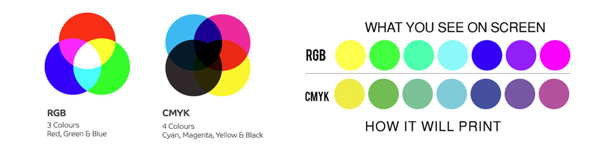
1. Designers use computers with RGB screens to design while Printers use CMYK
All computer screens use the colour mode RGB (Reds, Green and Blue) and omit light showing colour as opposed to printing processes of CMYK (Cyan, Magenta, Yellow and Black) being purely 4 colours printed on a sheet of paper. Computer screens are also usually not colour calibrated or stay in a special light-controlled room to ensure colour stays constant, so what you see on screen may not always be what you get!
It’s all about expectations and what can and can’t be achieved on paper so keep this colour mode difference in mind when designing and ensure all your elements in your design document have been
converted from RGB to CMYK before sending them off to be printed. The conversion will also show you the colour difference you can expect between the two forms.
2. Designers design across pages
While designing spreads on a computer screen may look wonderful and absolutely perfect, especially when taking detailed pics, text or bands of colour across pages, this is a Printers true NIGHTMARE! Multiple pages from your document are imposed onto large sheets that, once folded and bound, make up the final folded and cut publication; so to try make all these pages line ups perfect in folding and binding is virtually impossible. There are always tolerances in print finishing so be aware of this. Design for the strengths of print, not for the beautiful large spreads of photographs that will make the end user wonder why the detail across pages (photos and banners/strap lines) do not always line up with each other.
3. When you have body copy text in CMYK and not Black in your design
Full colour black text is a huge NO NO. Text must be 100% black and not made up out of the 4 print colours of CMYK. For a printer to register full colour small type across the whole sheet (of 8 x A4 pages) is virtually impossible. Keep in mind there are also influences like paper stretch at play as well. With CMYK body text you may well see other the other colours peeping out from behind the text making it look out of register and ugly. So just don’t do it. Pure Black only text is crisper and cleaner and overall, the best design practice. Retype if necessary! Your print piece deserves it.

4. Design should not include low resolution images for print
Ensure you always use the highest resolution possible for graphics and photographs when you design for print. It makes no sense choosing quality printing and nice paper but have images pixelated when printed due to them being under 300dpi. Not a nice look at all. 72dpi may be great for web pages and digital designs, but will never print well on a press. So ensure all your artwork is 300dpi for photos and images.

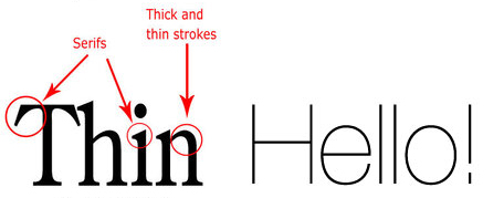
5. Design with fonts and line thicknesses in mind for print
Watch your font size and type as well as your line weights. Tiny text and fine hairlines in your design may look perfect on screen but may be too small and become illegible in print. The typeface you pick also plays a role. So never go below 6pt text size as a rule of thumb. If the typeface has is a ‘light’ font or a very ‘cursive’ font with thin strokes, you will need to watch how small you go.
The same applies to line work. When you design for print even linework thickness plays a role. If the lines you design are too thin and not 100% of the colour you choose (not a percentage of the colour), they will look broken up and may not come out in the print at all even if they look cool on screen! If you want others to see your lines clearly, then never go below 0.25pt (quarter of a point) for litho and 0.50pt (half a point) for digital work. Always ask yourself the question “how will this print?”.
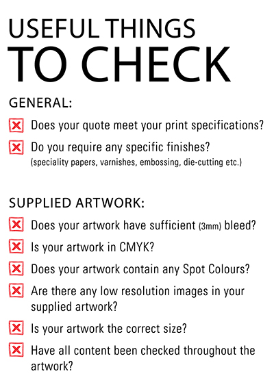
6. Give clear instructions for print and check your design doc specs against your print quote!
Check check check… is the motto a designer should adopt. Nothing worse than for the printer to get the files only to find the size is not as per the quote, the number of pages differ, there are low resolution elements in the file, RGB elements are in the file, the job has no bleed for cutting and elements are too close to the trim. Printers are sadly not magicians!
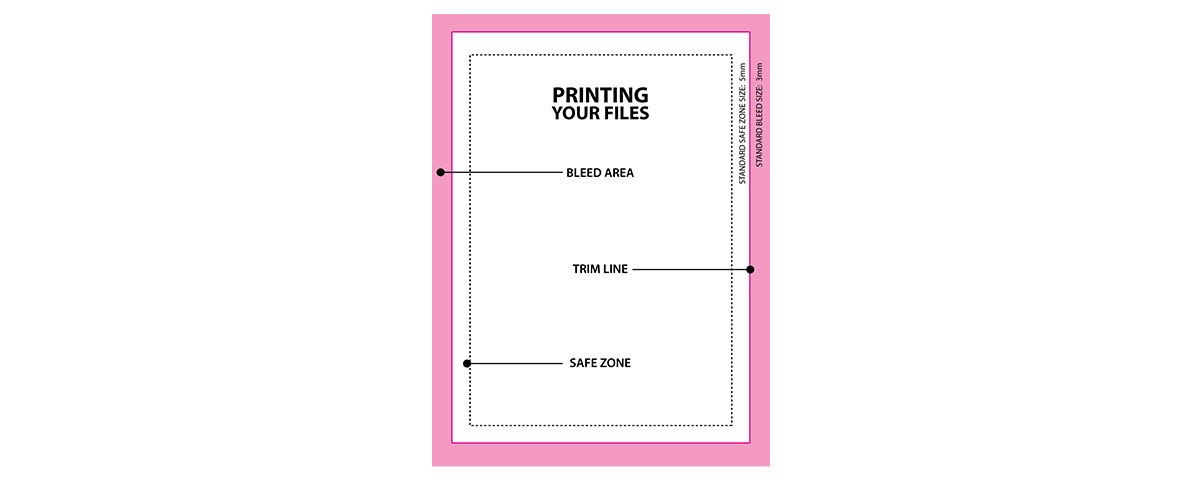
7. Design with print requirements in mind
Bleeds (the 3mm extended area outsize of your page size that allows for trimming tolerances in finishing),
Trim (the final size of your job) and
Safety Zone (that amount of space of at least 4mm that keeps all elements away from your trim line) may not be part of your design, but it should be. If you ignore these 3 vital components, items may well be cut off and your job cut smaller to accommodate no bleed. Don’t be a print finishing departments nightmare! Always allow for at least 3mm Bleed outside your trim line and at the very least, keep type and elements you don’t want cut off at least 4mm inside of the trim line.
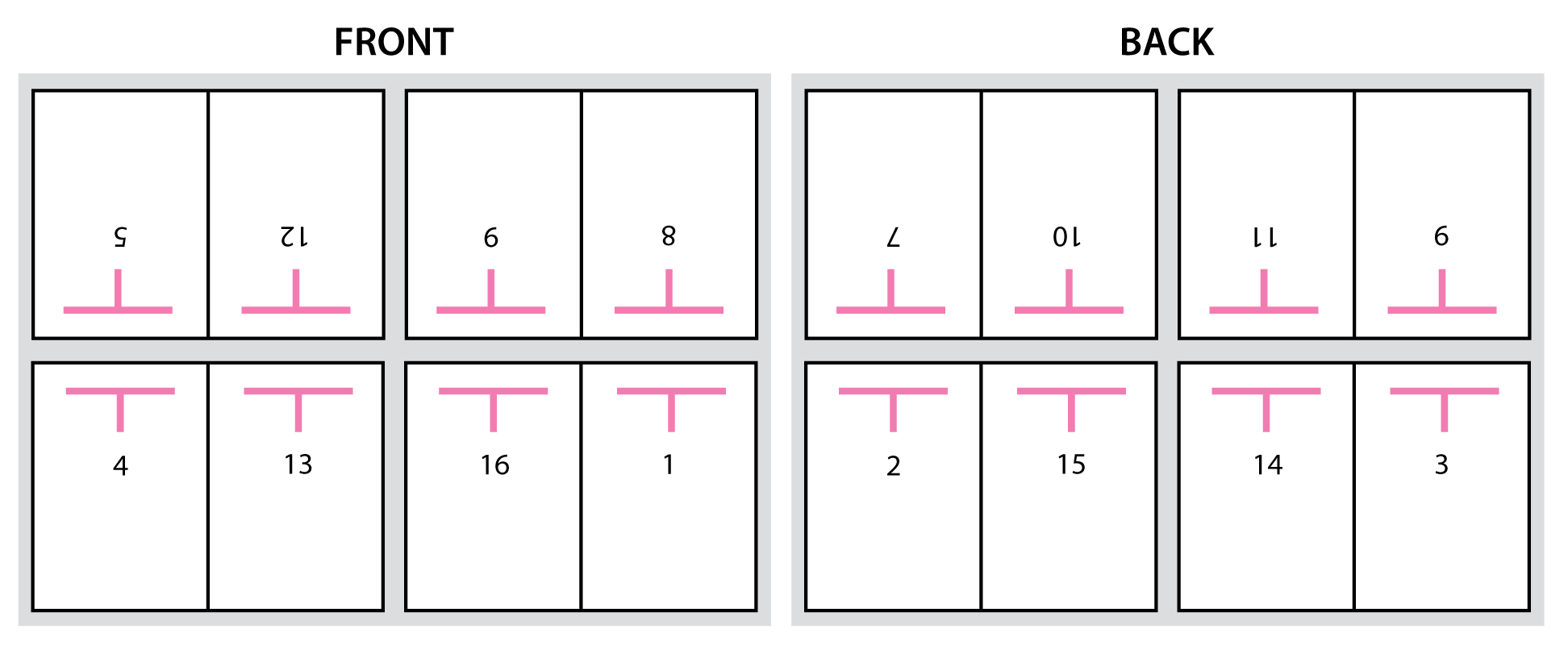
8. Design with page quantities in mind for print
If your print project has multiple pages and you are printing Litho, ensure the number of pages inside the publication is divisible by 4; always even numbers. Eg: 16 x A4 pages divided by 4 = 8pg printer’s sections. Printing presses need even numbers of 4 to print a section. If you supply 13 pages inside they will have to add a blank page to make it 14. And if you supply 15 pages then they will have an extra page that cannot be printed. So if in doubt, check with your printer as size of the publication and number of pages is very important. This will also be determined by the finishing method chosen. Printers cannot conjure up pages to fill a section or decide what to leave out, so this is very important!
9. Be careful of gradients and/or vignettes in your design
Lastly, your vignettes or gradient screens (especially those in grey) may look wonderful on screen but can be a nightmare for most printers. Remember printing works using percentages of dots at an angle imaged onto a printing plate. Then on the press the ink/water balance on rollers plays another roll. The image from the printing plate is transferred to a rubber blanket and then transferred to paper, so it can be a struggle to print these effects or even heavy solid colours as smooth as you may want or expect them to be. You may visually get some band marks that stands out against the smoothness of the rest of the printed sheet.

Also note that it is much more difficult to get a dark color to fade to zero than it is to get a lighter color to fade to zero. As an example: changing a light green to transparent gradient to a dark purple will print terribly. One thing that helps significantly with gradient banding is adding noise or a blur effect in Photoshop. This prevents the bands from appearing as significantly as they may.
So in short, try stay away from the dreaded grey or vignettes that appear so wonderful and pure on screen but may well give you a less than appealing final printed product.
Contact us today if you have any questions regarding how your design will print on paper. We want your success to be our success!
Print is, and must be, a partnership! Call us on 011 848 0000